3 Steps to Creating a Convincing Call to Action
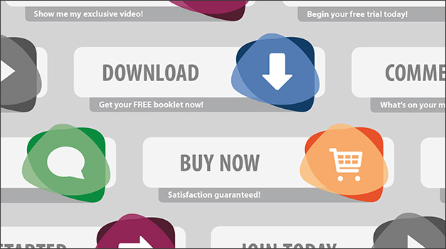
When you spot buttons to download, donate, or share; a QR code to scan or a link to visit; or simply an invitation to learn more, these are all calls to action (CTAs) in varying forms. A strong CTA—an instructive message that invites a user to do something—will motivate, persuade, and convince your audience. You can be the judge of the effectiveness of any CTA by examining your own behavior. Did you click on it? Were you tempted?
How can YOU create a call to action that inspires your users to click, read, or act? Here are our three steps to creating a killer call to action.
1. Make it compelling.
For best results, the language and design of your CTA should be carefully planned. One trick to boost your messaging is to create a sense of urgency. This can be accomplished by adding a time restriction with a reminder like “Offer ends soon!” Be sure to minimize any risk the user might feel; for example, you could use the phrase, “At no obligation to you.”

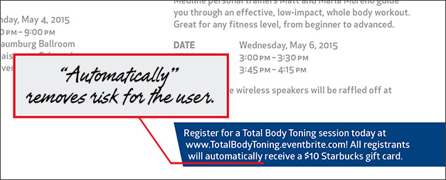
A client of ours recently needed a print ad, an email, and an Eventbrite page to boost attendance at an upcoming event for their sales reps. In the sample above, you can see that the use of the word “automatically” in the call to action removed risk for their users.
Of course, visually, your CTA should always be prominent and well-balanced within a composition. Design and style elements should be used to draw focus and build excitement without looking gaudy or disjointed.
2. Put yourself in your user’s shoes.
Pretend you are a member of your target audience. What would make you take action? Why would you ignore a CTA? This line of thinking will help you provide personalized, convenient calls to action that don’t alienate your audience.
Consider offering a reward for your user’s efforts, such as a PDF download, a white paper, a newsletter, or a video. This type of offer builds trust with your audience, as you’re providing resources in return for their action.

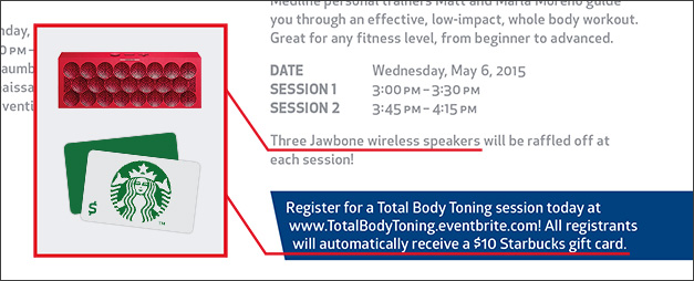
The audience is rewarded here twice! First, they’ll receive a Starbucks gift card just for registering, and secondly, they can win Jawbone wireless speakers if they attend the event.
In addition, if it’s appropriate for your campaign, try speaking in the user’s voice, for instance, “Download MY free PDF.” Remember, if you wouldn’t take action, neither will your user.
3. Try it out.
After your CTA is planned, deployed, and in action, don’t forget to check back and review its performance. If it’s not gaining the response you’d hoped for, change it up to optimize your results. Maybe it’s too low on the page. Perhaps it’s too pushy. A minor tweak may make all the difference.
Your CTAs may vary depending on where they’re placed, what the action is, and who the audience is. We hope these steps push your CTAs from ignored to inviting.
Have you noticed any CTAs that you just couldn’t resist? Tell us all about them in the comments section below! Hint: That was a call to action!
