Reflecting on the Life and Work of Adrian Frutiger, the Man Behind the Type
We were saddened to learn of the recent passing of world-renowned Swiss type designer Adrian Frutiger. The world of typography—and the world around you—would be very different without the work of Frutiger, who designed nearly 30 fonts, many of which you use and see every day.
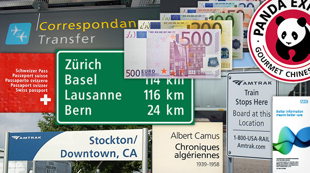
Frutiger’s most well-known fonts, Univers, Frutiger, and Avenir, can be found on street signs, in airports, and at train stations (as well as many, many other places). He crafted these fonts with the purpose of communicating a message in the most efficient way.
In his own words he says, “On my career path I learned to understand that beauty and readability—and up to a certain point, banality—are close bedfellows: the best typeface is the one that impinges least on the reader’s consciousness, becoming the sole tool that communicates the meaning of the writer to the understanding of the reader.”
Frutiger embraced multiple evolving technologies throughout his career, so it’s no surprise that his outlook on successful typography has withstood the digital age. Like with type design, intuitive and unobtrusive composition is the core of designing for the digital user’s experience. Frutiger’s timeless approach and his seamless combination of simplicity and spirit will continue to inspire print and web designers alike.
Learn more about the life and work of Adrian Frutiger here.
