Adventures in Wallpaper
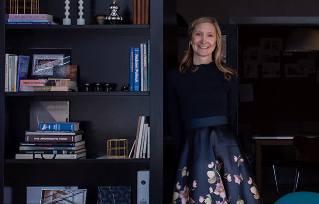
Editor’s note: Suzanne Shumaker, along with her husband and fellow architect Garry, launched Shumaker Design + Build Associates in Evanston, Illinois, in 2009. Since then, they have been leaving their distinctive imprint on elegant residences and impressive commercial spaces across the Chicago area—including Street Level Studio’s creative workspace. Inspired by their artistic vision and design expertise, we asked Suzanne to share her thoughts on what she is seeing—and doing—with wallpaper.
The First Layer
Much of my initial exposure to wallpaper was just that—exposure—literally peeling back layers and layers of wallpaper applied over decades in old buildings. After graduating with a Bachelor of Architecture and a minor in Interior Design from the University of Kentucky in 1999, I spent my early career at architectural firms in New York City, remodeling historic homes and elegant, prewar apartments on the Upper East Side and around Central Park.
These spaces were like design time capsules. From the 1930s to the 1960s, almost every home featured wallpaper in it somewhere. And, as I quickly discovered, the styles ranged from the ridiculous to the sublime, from dainty patterns to large panoramic scenes, from nature-based Arts and Craft prints to psychedelic geometrics. But by the time I started my career, wallpaper had almost totally fallen out of favor. Replaced by paint, which offered a more subtle backdrop for simpler, more minimalist designs and wasn’t notorious, like wallpaper, for being difficult to apply and remove.
Though it wasn’t a big part of my visual design approach back then, I was fascinated by wallpaper as an art form. So, I am delighted this classic is cycling back again and enjoying a renaissance that appeals not just to older generations but also to millennials and members of Gen Z who don’t have a history with it and aren’t afraid of making the commitment. Now everyone is talking about how accessible and easy it is the change their space, upgrade their aesthetics, or add some drama with wallpaper—better than paint.
Getting the Hang of It
My own personal experience with wallcoverings also has been a bit of an “unveiling,” much like peeling back all the layers during those early projects in NYC. It has been wonderful rediscovering it.
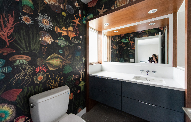
Five or six years ago, a few of our more adventurous clients indicated they were willing to take a risk with wallpaper. Most started out using it in small spaces, like powder rooms, where it was considered okay to go darker and be a bit more daring. Now, people are excited to see wallpaper as something unique they can experience and enjoy in all parts of their environment, including bedrooms, kitchens, breakfast areas, kids’ rooms, and living rooms. They are open to being more creative and expressive—which fits in perfectly with our design philosophy.
Like many designers, Garry and I are driven by the simple notion that good design should create an environment that is responsive to the needs of the client, stimulates them, and enhances their everyday lives. Fundamentally, it’s about being thoughtful of how they live, mindful of their surroundings, and focused on the details that make their spaces uniquely their own. It’s exciting to see the combination come together, creating spaces that celebrate the family and their life in their community. Wallpaper satisfies the need to make a personal statement without having to overdecorate in other ways to feel like you’ve created something special.
On a Roll
As architects and designers, we always try to find the wallpaper first, with our other choices trickling down from there—color palette, finishes, fixtures, window treatments. I used to find the options with wallpaper somewhat limited. I had knowledge of a couple of brands and would go and pull them at the Merchandise Mart. After not too long, it seemed like what I saw had been there for a while.
Now, there seem to be almost endless options and ways to discover them. The physical format has also evolved, from rolls and repeating patterns to panels that make it easier to accommodate architectural details. Sometimes the choice is more about the space than the client. That’s okay, too. As long as we are creating an environment that is true to the history of the home and the family feels comfortable living in it, the only thing that dictates the choice is ending up with something unique.
Newer papers have come a long way, with many options you wouldn’t have recognized as wallpaper 25 or 30 years ago. The creative inspiration behind the new wallcoverings runs the gamut. Telling a story. Triggering a mood or feeling. Bringing the outdoors inside. Some aspire to comparisons with a piece of art. Others include pets and animals to make the design more relatable. Some are big, bold, and bright. Some invite more intimate inspection with details you can only appreciate up close.

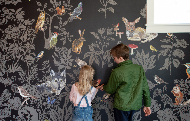
Thoughtful and creative use of wallpaper can add a whole new dimension to a room. Rooms filled with pattern provide an experience which can be boldly stimulating or quietly relaxing depending on the choice. One of my favorite recent projects was using a wallpaper covered with a life-size Illustration of a fairytale forest—complete with creatures—to frame amazing views to the woods outside a child’s bedroom window. I imagined it as a perfect space for encouraging daydreams and bursts of creativity.

The growing proof that environments influence mood and emotion is becoming more important as we all spend more time in our homes and less time out in the world. Design can produce restorative qualities in homes that create a healthier, calmer environment. Spending time in the great outdoors, for example, has been scientifically proven to reduce stress levels, help you find clarity, and rejuvenate your mind and body. The trend toward biophilic design—design that creates a visual connection to nature—is especially prominent in many of today’s most popular wallpaper styles. Walls covered in botanicals or outdoor scenes can achieve much the same effect as living walls or groups of potted plants but without the maintenance or expense.
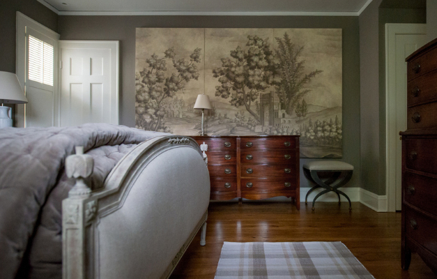
In some instances, wallpaper has become like owning a piece of art, with the home as a gallery. For one project, a client (who is a preservationist) really wanted the dramatic look of a hand-painted mural on the walls of her master bedroom. Instead, she chose to go with a unique wallpaper approach that offered more impact at a lower cost and allowed her to preserve the paper as art that could be easily moved. To emphasize the artistic quality of the wallpaper, we had three different panels stretched like canvases and hung them on the walls. The effect was stunning.

Using New Tools
The designers who create today’s wallcoverings are also enjoying the opportunity to get more creative with new design and production approaches. Digital technology has been a game-changer, enabling surface designers to execute stunning visuals with an amazing degree of detail, texture, and color depth and without the limitations of traditional wallpapers regarding repeats and panel size.
Digital wallpaper design and production also enable an unprecedented level of customization. Almost anything, drawn from almost any inspiration, is possible. If you imagine it, a graphic designer probably can apply it to a wallcovering design. There are practical aspects, too. Digitally drawn room schematics, for example, make it possible to position key elements in a wallpaper design strategically to account for paneling, window placement, fixtures, and millwork.
I love the idea of going in a digital direction. It’s an exciting new tool we can use to help clients customize their spaces and do it at a different level. It’s their home or business. Our goal is always to guide them to choices that will resonate with them and speak to who they are. It’s not just about the color of the year or what’s trending. It’s a whole new path we can take.
I think customized digitally designed wallpapers are also very well-suited to commercial environments. Companies can distinctly brand their locations and create a unique ambiance that is unmistakably associated with their business. I experienced this firsthand recently. I was considering using a design element in a kitchen. In this case it was a backsplash tile, but the principle holds true for wallpaper, too. Unfortunately, every time I looked at it, I immediately thought of a popular and prolific coffee company with locations on nearly every corner! The association between this design element and the company was unavoidable.
One way we see this playing out in commercial spaces is using dramatic, floor-to-ceiling, high-quality photographic images, such as landscapes that connect to a geographic location. As a photographer myself, I find this approach very evocative. I carry my Nikon D710, 35mm art lens with me everywhere I go to document what I call “the art of the everyday.” The rich details, moments, and colors found in photographs can inspire special ways to personalize spaces with wallcoverings.
A Seamless Experience
Today, it’s impossible to ignore the demand for “experience-based spaces”—homes and commercial environments that have a psychological and personal impact as well as leave a visual impression. Wallpaper, in all its refreshing and remarkable modern interpretations, is one of the most approachable—dare I say seamless—ways to meet that demand! I, for one, am delighted it has mounted a comeback. I can’t think of a better way to add dimension, life, style, and personality to any space.
