Creativity on Tap at Canon’s App Room
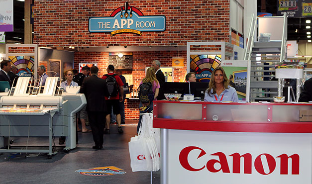
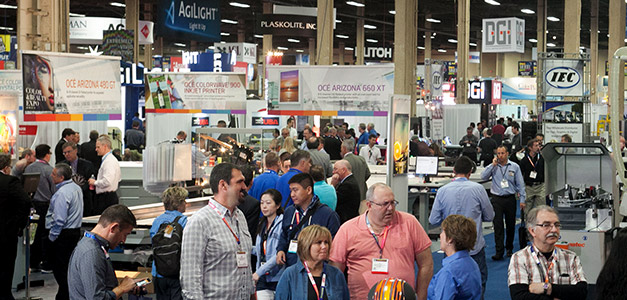
As the 2015 ISA International Sign Expo approached earlier this spring, our client Canon Solutions America decided they wanted a fun and fresh way to display the wide range of applications their large format printers can produce. They enlisted our help in designing the pieces that would make up “The App Room,” a 20′ x 9′ display room within their show booth.
It was all hands on deck for this project, with every person in our office working to make sure each piece fit cohesively in the space, which was styled to look like a neighborhood bar. We developed more than 25 pieces specifically for the room, all printed on varying substrates and at varying sizes. Special consideration was made for the environment and medium of each piece, from the handheld coasters to the overhead storefront sign that could be seen from several booths away.
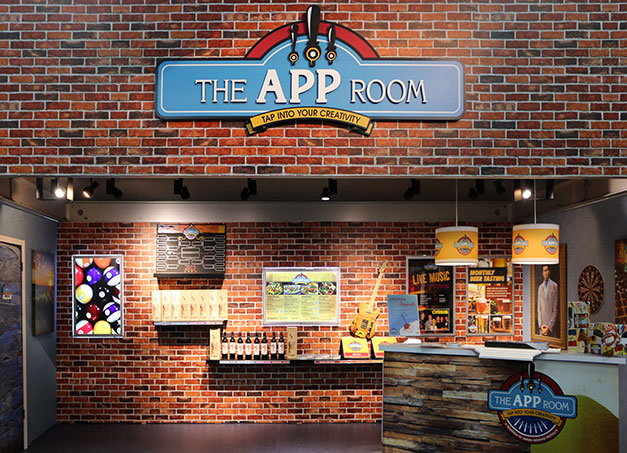
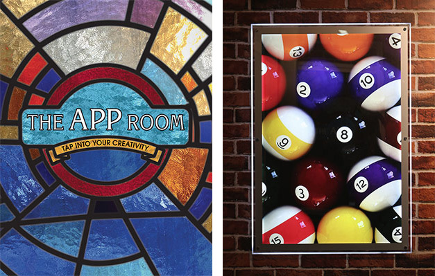
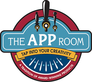 Our first step in this process was to create the App Room logo, which incorporated colors from the Canon Solutions America brand and the room’s tagline, “Tap into your Creativity.” We then adapted this logo for several applications, such as stained glass panels, wallpaper, a bar, floor graphics, and an overhead storefront sign. This storefront sign was produced by printing different elements of the logo on separate panels, and then layering each panel to create a complete, multidimensional piece.
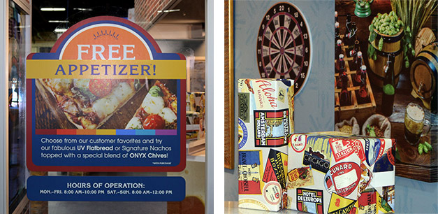
To draw in show attendees, the room featured two L-shaped walls that extended forward from the main structure. For these plexiglass walls, we designed a “free appetizer” cling, which is right reading from both sides of the wall, and a stained glass panel, whose lead bars were printed in multiple passes to create a raised, 3D effect. In addition, we designed a standing specials sign to sit nearby. The artwork for this sign was printed in white ink on a chalkboard substrate.
Using elements from the logo, we designed wallpaper for the left and right interior walls of the room, which offered a backdrop for a wide variety of applications and showcased two different wallpaper substrates. The hanging applications we created included multiple posters, backlit signs, canvases, and a dartboard that was printed directly on a corkboard substrate. We also designed takeout pizza boxes that sat on a few mounted shelves below these hanging pieces, as well as horizontal strips attached to the shelves for an extra pop of color.

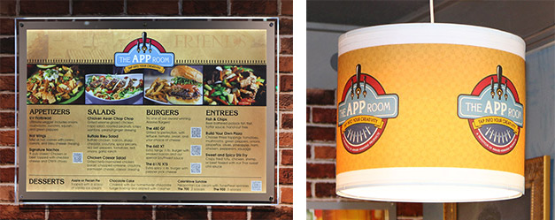
Designing the graphics for the bar itself was a particularly complex challenge because it was constructed from two different substrates, split right down the middle. We developed two separate designs that came together flawlessly, as you can see in the photo below. Above the bar, two hanging lights illuminated the area, and we created a design for them that included the App Room logo and that was printed directly on their lampshades. Several of our applications sat on the bar as well so attendees could take a closer look. These included wrapping paper, coasters, menus, and a standing “drinks and desserts specials” sign.
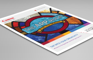 With so many applications on display, our client needed a way for attendees to see all the details about these pieces at a glance. We designed a branded “takeout menu” to give visitors the information they needed in one convenient place, as well as an accompanying standing brochure holder. You can download this “takeout menu” here to learn more about all of these applications.
To complete the trade show experience, we designed directional floor graphics to lead guests to the room and branded wall graphics for the exterior sides of the structure. We also created hanging banners and a popup banner to highlight specific products and to attract attention from outside the booth. And of course, we developed a digital element, a preview email to invite potential attendees to register.
This project consisted of a lot of moving pieces and was truly a team effort. We took pride in seeing all of these different designs come together to provide a one-of-a-kind, interactive experience that satisfied our client and engaged the booth’s visitors.
