by Kent Brubaker, Website Manager and UI/UX Designer (aka Dr. Digital)
One of my favorite websites presents a rendering of the solar system where the moon is represented by a single pixel. By scrolling laterally, you get a relative sense of the size of the planets, the distance between them, and the enormity of our galaxy. Mind blown!
It’s a great example of a site that transforms visitors into participants. In other words, it’s more than information; it’s an experience. So, let me answer a few of the most common questions about experiential web design.
What Is Experiential Web Design?
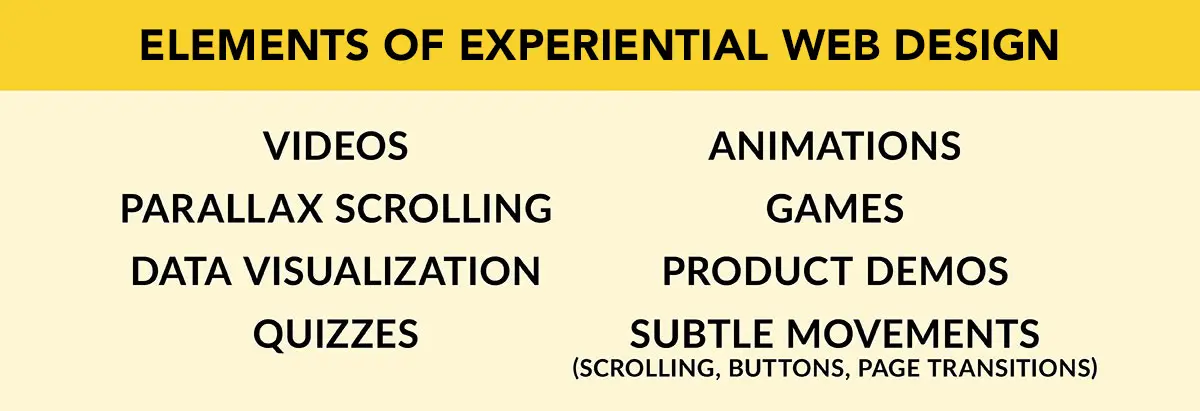
Experiential web design presents users with an immersive, engaging online experience through interactive content and movement. With eye-catching aesthetics and features like videos and animation, this approach elevates a site’s content and brings the audience in.

Why Develop Experiential Websites?
I’ll be the first to tell you that an experiential approach offers plenty to brag about. First, it’s more interesting to use than a static site—which means it’s better at holding our notoriously short attention spans. You have seconds, at best, to capture and keep the eyes of anyone who happens to click over. Do that, and you’re adding indelible impact to your key messaging! Plus, it can liven up content that users might struggle to get through, like annual reports and employee training.
Experiential web design also transforms long-form content into shorter, more digestible pieces. For example, instead of searching through endless troubleshooting articles, an interactive quiz can help users find exactly what they need.
Want to see what I mean? Check out this PDF quiz Street Level Studio created for Canon Solutions America’s online resource center. It’s designed to help their clients decide which digital production press is best for their business.
Click around and see how easy it is to use. The immersive approach gives users a hands-on feel—an especially helpful tactic when working (and selling) remotely or when circumstances prevent your audience from gathering in person.
What Are the Top Tips for Experiential Web Design?
Don’t be overwhelmed by all the experiential options. Keep it simple and start here:
Choose the right functionality for your content. One of the advantages of an experiential approach is mixing and matching elements. Browse the options on platforms like Vev and Ceros to find the solutions that work best for your project.
Find the right balance. It’s important not to overload your page with motion. Visiting your site should feel effortless, and users should intuitively know where to look. At the same time, there should be enough excitement to keep your audience interested and interacting.
Tell a story. The interactive elements you add to your site should give your content a clear flow. A structure—especially a narrative one—will help your users know where to navigate next and keep them engaged through every step.
What Does Successful Experiential Web Design Look Like?
There’s an art to creating a site that’s as compelling as it is captivating. Take a look at how we structured the dynamic Canon Solutions America varioPRINT iX-series Experience. This online experience won a prestigious Graphic Design USA Digital Design Award™, recognizing “the power of design to enhance online communications and experiences.” The project faced fierce competition to land in the top 10 percent of more than 2,000 entries.
Want more? This blog on balancing site engagement with functionality is also worth the read. And not to get too meta, we even won an award for a blog post about our creative team’s ability to design and develop great websites.
If you’re ready to experience how our website design and development expertise can take your online presence to the next level, let’s talk!