How to Make Design More Than Just a Decoration
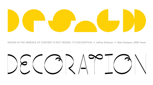
A picture is worth a thousand words—but sometimes having a few actual words helps that picture say more. After all, as Web Designer Jeffrey Zeldman said in a 2008 tweet: “Design in the absence of content is not design, it’s decoration.” Understanding the appropriate balance between copy and design is tricky, especially when working on marketing materials, so we brought Creative Director Grogg and Copywriter and Proofreader Kelsey Ingram together. We asked them to share their insight into how creatives can accomplish grammatically correct yet attention-grabbing copy and stimulating design.
Both agree that discussing the project’s end goal ahead of time, before anything gets drafted, is essential to effective marketing messaging. What’s even more helpful, Grogg says, is when writers and designers can brainstorm from the other’s perspective.
“The best writers and editors, to me, are visual people,” he explains. “Sometimes, they’ll come up with a concept and say, ’This headline would look great if we did this to it. What if we tried such-and-such treatment on this word?’ Those collaborative experiences not only make the process move faster but ultimately create a better product.”
He is quick to point out, however, that writers armed in advance with a specific vision for the graphics are one of the biggest challenges to a designer—especially when grammar gets in the way of clean design.
“Sometimes words can bury the interesting fact,” he says. “Changing the word ’four’ into a numeral, for example, is more visually appealing from a design perspective. But from a writer’s perspective, this doesn’t work with the given style guide. My job is to make things more visually appealing, so working with the proofreader, writer, etc. on the way grammar rules look visually is important.”
Continued communication throughout a project is essential for both sides. Making a brochure cannot simply be an assembly line process where copy is written and then handed off to the designer, or vice versa. Neither copy nor design will make sense or create an impact in that type of process.
“If a designer has an idea as to how they want to treat text, I try to work around it to make sure the grammar stays but doesn’t get in the way,” Kelsey says. “It’s helpful to know this ahead of time so I can keep the text punchy, but grammatically correct. However, there are times when I have to stand up for the copy. It may not ’look pretty,’ but in terms of messaging, that’s how you get an audience to act. Changing the word to a synonym, rearranging text, or adding a different pun to suit the design can drastically alter the tone and meaning. Likewise, font families, sizes, and weights can make a serious piece appear comical without the right treatment. Content creators need to be in these design discussions. The design supports the copy, not the other way around.”
“Hmm. Perhaps from your perspective, Kelsey!” Grogg laughs. “It’s not a universal rule.”
The effect on user experience (UX) when these two departments work together is seamless. When focused on achieving the same goal—whether that’s increasing online engagement, selling a product, or triggering some other consumer action—marketing material becomes all the more effective. UX writer Laura Luck agrees. “Design supports and promotes your brand while copy does the selling for you,” she says. “[Together] it means the customer doesn’t notice the design at all. (And that’s a very good thing.)”
Design also gives structure to the copy, guiding readers through it for greater readability and your intended actionable outcome. Think of any advertisement or website you spent longer than ten seconds reading: did it have tons of graphics all over the place, making copy the background player, or were the graphics minimal and supportive, yet distinct enough to catch your eye? Chances are there was enough of a balance between the copy and design that one didn’t overpower the other.
So instead of two independent elements, design and copy should be approached as a single creative force with a shared goal.
“I’ve had writing partners that came up with great design and I’ve come up with great headlines,” Grogg admits. “It helps tremendously to have designers that understand grammar and writers that understand design elements—it helps cut down on conversations that hold a project up. That’s not to say designers should be copy experts or vice versa, but it’s easier to keep to a deadline.”
“Exactly,” Kelsey concurs. “It’s that Ratatouille mindset: Not everyone can come up with a stellar design or headline, but stellar ideas can come from anywhere. I never discount a clever copy suggestion just because it came from a designer. Their input often works better because it fits the concept for the layout. It’s a win-win.”
