Putting Up a Fight: The Impact of Posters
Have you been inspired by the clever ways the creative community found to contribute during the COVID-19 crisis? We certainly have. Outstanding examples—from fascinating animations and stunning data visualizations to hilarious social media memes and posts (choose your own favorites)—have been lighting up the internet and our Instagram feeds.
If ever there was a perfect time for artists, designers, illustrators, typographers, videographers, and creative influencers of all kinds to put their talents to use, this is it. Right now, educating and encouraging people is of paramount importance. With so much misinformation out there—at a time when knowing the truth, understanding the risks, and protecting yourself and others is a matter of life and death—what better way to make a big difference?
Throughout history, one of the most graphic ways to convincingly communicate important messages on a broad scale was putting up posters in public places where people couldn’t possibly overlook them. An article in The Atlantic last month offered some great examples of how cities and states used posters to educate and enlist the populace’s cooperation during public health crises in the past.
When influenza hit Chicago in September 1918, posters around town informed the public the city had implemented containment measures, including police enforcement of covering your face when coughing. During the dapper but flu-plagued 1920s, posters showing fashionable folk and judgmental shaming cautioned against “careless spitting.” Cartoon posters titled “How to Die Before Your Time” used sarcasm to stop the spread of flu in the 1940s. And in 1949, the Museum of Modern Art (MoMA) invited a group of artists to create public health posters to combat polio.
So, not a big surprise the impact of this kind of eye-catching, paper-based PSA is still high, even in the age of technology. During COVID-19, posters are at the heart of some remarkable international initiatives rallying creatives to come up with inventive graphic messages to help fight the spread of the virus, keep people safe, and lift spirits. The range of works produced is nothing short of amazing.
Here are a few of our favorite pandemic poster projects that deserve a look.
Stay Clean, Stay Strong
Back in February, as Chinese workers started returning to their jobs, a team of designers at Shanghai studio JWDK launched a series of themed posters aimed at contributing to the fight against COVID-19 in the workplace. Referencing historical public health posters used in the country during the 1950s, the series of four posters uses soft colors, realistic illustrations, and direct instructions to provide gentle, but clear reminders to follow recommendations laid out by the government and the World Health Organization.
#COMBATCOVID
Remember those posters MoMA commissioned during the 1949 polio epidemic? The current pandemic inspired Steven Heller, co-editorial director of PRINT magazine, to write an article about their impact on the public and his childhood. That piece in turn inspired action from Julia Knight, museum director at New York City’s Poster House.
Knight thought the “government messaging released at the onset [of the current pandemic] was too obtuse and hard to understand,” but believed “designers could solve that problem as long as we could get their work seen publicly.” So, she teamed up with PRINT magazine to “launch a citywide public art campaign featuring PSAs and messages of love, gratitude, and solidarity with New York City’s frontline workers.”
The effort, #COMBATCOVID, enlisted top NYC graphic designers to more clearly and creatively communicate important messages during the crisis. Partnerships were formed with out-of-home advertisers LinkNYC, JCDecaux, SILVERCAST, Pearl Media, and Times Square Arts, which were willing to donate their screens so the PSAs could be seen by millions of people. By April, the posters appeared on nearly 1,800 digital screens in all five NYC boroughs and beyond, including a two-sided digital billboard at the Lincoln Tunnel and more than 300 screens on bus shelters and newsstands in New York, Boston, and Chicago.
Stay Safe, Stay Sane
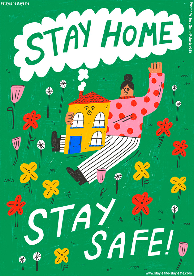
Last month, the streets of Breda, the Dutch city with the most coronavirus cases in the country, were suddenly covered with cheerful, colorful posters sporting positive messages for living through the pandemic. Arranged by Graphic Matters, a Breda-based biannual visual arts festival, the poster blitz was part of the Stay Sane, Stay Safe project.
Founded by Netherlands design studio Lennarts & De Bruijn and lettering agency overdeschreef, the idea for Stay Safe, Stay Sane was spontaneously hatched on March 22 when a friend who works in healthcare asked the designers if they “had an uplifting poster lying around” to put up at the hospital. Just two days later, the pair initiated the rapid-fire launch of a fully operating pro bono poster platform, which now offers more than 1,700 downloadable designs by creatives from 80-plus countries.
Initially led by the simple mission to receive, create, and share “uplifting and thankful messages to our caretakers, lifesavers, and hospitals,” Stay Safe, Stay Sane’s goals have expanded beyond providing positivity to offering clear and critical instructions on how to navigate the pandemic. And in an unexpected but karmic way, it’s also become a conduit for helping the world’s creative community share and spread their work during a tough and financially challenging time.
