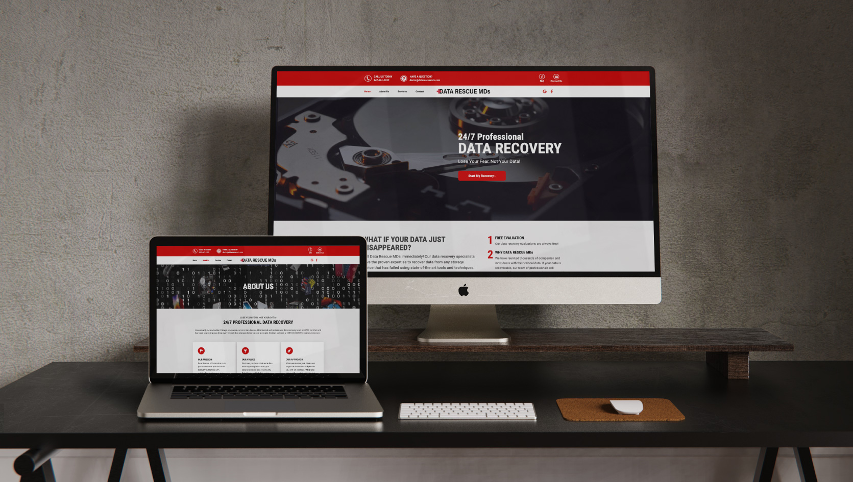
Rx: Website Redesign for Data Rescue MDs
Having saturated their homegrown client base of local, smaller businesses, Data Rescue MDs was eager to enter a larger market. The company needed a web presence that would emphasize their expertise and proficiency at recovering data from failed storage devices. That meant a more engaging, intuitive website that presented:
- An improved user journey
- Compelling calls to action
- Crystal clear delivery-of-services communication
Street Level Studio (SLS) stepped up for a site redesign that would help Data Rescue MDs achieve these goals and, in turn, validate its credibility among a larger emerging market. It would be just what the doctor ordered, and this was what we prescribed:
Thinking Beyond Competition
Comparing your company’s online properties to those of your competitors might seem like a sensible point of departure for redesign efforts. And early conversations with Data Rescue MDs’ leadership revealed their desire to emulate other seemingly successful organizations in their market space, but the SLS team was quick to emphasize inspiration over imitation.
When it comes to site design, our team always urges clients not to look too hard at their competition. Good design should surpass what they offer, not show parity. Instead of competitors, always look at the latest industry standards for design, user journey, and other aspects of speed and performance optimization.
The Need for Speed
Data Rescure MDs needed this site fast, so SLS streamlined our process and created a design ready for back-end web development in less than four weeks. For a 15-page site, this included a detailed site navigation map, the wireframe phase, the content outline, and web design. And while we all moved at an accelerated pace, client contacts and the design team alike remained focused on:
- Guiding site visitors toward very specific interactions
- Ensuring consistent brand application throughout
- Integrating eye-catching imagery and graphics
- Preparing for easy client handoff for development and deployment
Mobile-First Mindset
An informative, intuitive, uncluttered UI/UX mentality demands designing for mobile, so modernizing the look and feel of the Data Rescue MDs site was only half the battle. The other was ensuring it was a more responsive platform overall. The previous site looked good enough on a desktop but had serious challenges on a mobile device.
Knowing more and more users are experiencing sites through their smartphones and tablets, the SLS team decided to make the site’s mobile experience top priority. This meant designing for the small screen, allocating room for concise and easy-to-read content, uncomplicated graphics, and key aspects such as larger buttons surrounded by more white space. And while all of these elements worked well for those mobile devices, the SLS team took care to ensure they also translated cleanly to desktop deployment.
The Doctors Are In . . .
The company’s redesigned site is delivering. The easily navigable interface facilitates visitor interaction, and the chat functionality delivers answers to their key questions fast. It adds up to a reassuring, informative interaction, which is definitely appreciated by prospective customers who may be in panic mode. The Street Level Studio redesign has definitely given the Data Rescue MDs website a clean bill of health.
