Sharing a SLYCE of Website Success
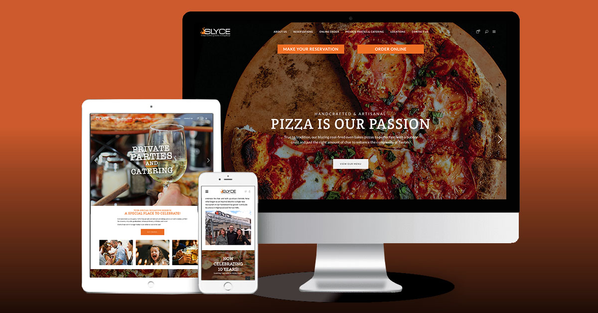
It’s always satisfying to launch a website we designed and developed—but it’s especially sweet when it’s a restaurant site we practically cooked up from scratch. Just days ago, the new SLYCEcoalfiredpizza.com went live, and, like a piping hot pie with perfect toppings, it should be shared.
SLYCE Coal Fired Pizza Company is a family-owned business with three popular suburban locations near Chicago. Its claim to fame—and flavor—is preserving the art of artisanal coal-fired pizzas, emphasizing fresh and creative ingredients, and delivering a dining experience curated with four-star attention to detail.
After tasting coal-fired pizza on the East Coast, SLYCE’s owners Laurie and Brittany Barth, decided to bring the concept home and add their own elevated flair. After quickly opening three locations and eyeing potential future growth, they realized they needed to make the online SLYCE experience as special, memorable, and satisfying as eating there.
The Inspiration
Now more than ever, the website is both SLYCE’s digital storefront and its most powerful marketing tool. It’s where people view the SLYCE menu, check out hours and addresses for each location, make reservations, place to-go orders, inquire about private events, and get to know the business. As such, it deserves the same attention to detail, design, and functionality as the physical locations.
So, for SLYCE, the new site needed to be more food-forward—reflecting its passion for authentic pizza craft, creative menu variety, and insistence on making everything on site—as well as relate its brand story and remarkable hospitality in an engaging way.
The First Ingredient: Brand Strategy
Redesigning the website also offered the opportunity to take a step back, take a breath, and strategically brand the fast-growing company. A key element would be bringing all three current locations under a single, cohesive brand umbrella and letting customers see they could count on a consistent, quality SLYCE experience every time, at any location.
We began by interviewing stakeholders, from the owners to the staff, and talking about their personal experiences and connections with the company and the brand. Then, using their observations and competitive research, we brainstormed and developed a cohesive brand strategy in collaboration with the client team. The process included defining their business aspirations (vision), creating a clear mission, identifying key customer segments, and fleshing out the brand personality.
Rewriting the Recipe
With the brand roadmap in hand and a goal to create a site that could organically grow with the business going forward, we began the design-build process—starting with evaluating the pages on SLYCE’s existing website to see what worked and what didn’t. Based on this analysis, we went to work constructing a website that was elevated not only in how it looks but also in how it works. We made sure it offered an enticing user experience—informative, enjoyable, easy-to-navigate, and responsive, no matter the device.
Invitations to interact with the site—view the menu, make reservations, order online—were designed to be easy and placed prominently up front and center. For even more mobile-friendly functionality, we also made sure the site was connected to the platforms SLYCE customers prefer to use. And we didn’t forget optimizing the site for the client, building in a CMS so staff can easily update menus and add content.
The most notable design change was refining the imagery in keeping with SLYCE’s reimagined pizzeria experience. Photo shoots yielded mouthwatering food shots, inviting interiors anchored by the blazing coal oven and open kitchen, and welcoming outdoor dining scenes. Strategically placed within the site’s clean, uncluttered, fresh design, the photographs deliver a clear narrative of what it feels like to have the SLYCE Experience.
Mixing Words and Pictures
As the design evolved, we created fresh content to introduce the people behind SLYCE and tell the brand story, showing their personality as well as their “passion for pizza.” This included educating customers about the unique characteristics of coal-fired pizza—such as the distinctive “leoparding” on the crust that signals it’s at its crispy, chewy best—and encouraging them to embrace the char.
Our overriding site content goal was to be unique, yet relatable; make it feel like your go-to neighborhood spot, but promise a consistent level of quality and hospitality regardless of the location. All are important considerations as the business continues to grow.
A Collaborative Effort
Ultimately, continuous collaboration proved to be the main ingredient in producing a successful new website. Throughout the entire process, weekly meetings with the client and persistent communication were the mise en place that kept us prepared and organized at each stage of design, development, and execution.
Now, like a proud chef, we are delighted to share our latest creation with you! Can we cook up something new and exciting for your online presence?
