The Trend to Debrand: Embracing the Bland?
In the early 1960s, a visual art trend emerged in the US featuring ultra-simple geometric shapes like squares and rectangles. It was a radical departure from the more ornate, organic styles of previous decades. Labeled minimalism, its champions included Frank Stella, Robert Morris, Agnes Martin, and Judy Chicago. As happens with every art movement, the radicals were inspired, the establishment was shocked, and the mainstream was simply confused.
Minimalism Goes Mobile
Minimalism is experiencing a renaissance of sorts today—not in the exhibitions you might take in at MOMA or the Art Institute of Chicago, but in the app icons and mobile websites you interact with on your smartphone. Once-elaborate logotypes and mastheads, originally meant to be viewed on a desktop monitor or seen on large-scale signage and in print, are shedding what many consider superfluous elements so the essence can be seen, processed, and interacted with on mobile devices as quickly as possible.
At first glance, this trend makes sense for mobile electronic interfaces. (Heck, you’re probably reading this post on your phone or tablet.) We are all so familiar with the icons on our phones there’s effectively zero mental processing required to find, tap, and start thumb-typing. But those icons represent pure functionality. They’re not necessarily meant to have personality.
What Debranding Looks Like
So why are more and more brands hopping on this minimalist bandwagon? Ben Shawn offers a well-articulated Bloomberg Opinion here. It’s worth the three-minute watch for both the insightful explanation of the debranding trend and the entertaining samples of favorite logos going on a design crash diet.


Still Open to Debate
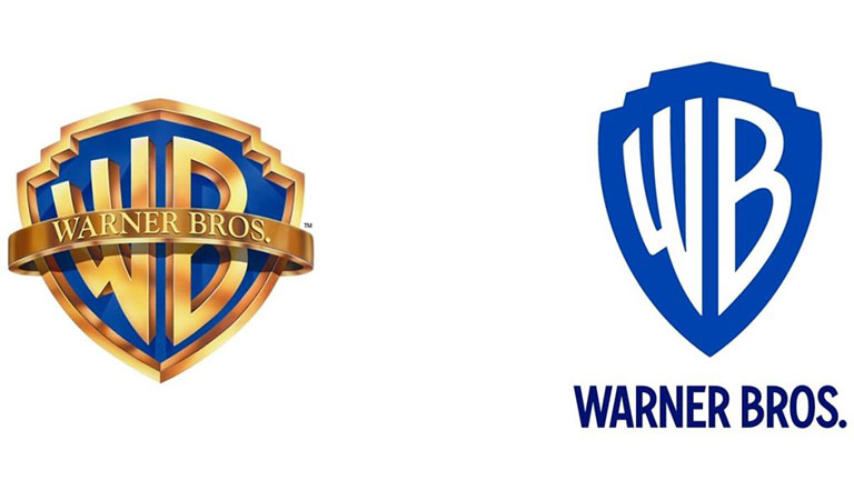
But even as the trend gains momentum, some people see debranding as denuding—reducing once-warm, iconic images to their skeletal essence. Take the Warner Brothers logo. The argument could be made that all the gilt elements conjuring Hollywood glam and the cinema palaces of the 20s and 30s have been replaced by what looks like a vector drawing. Yes, it pays homage to the logo from which it is derived, but does it work on its own or simply because we know its historical context?

Proceed with Caution
For you or any company looking to recreate, reinforce, or streamline their logo, the conversation has to start with context. Where will the logo live? It’s highly unlikely it will be be completely confined to the mobile app/mobile interaction realm. Is its main purpose functional, informational, or emotional? Do you want to chest-thump, convince, or simply connect? How does it need to support your go-to-market strategy?
These questions make a compelling case for not just jumping on the minimalism bandwagon. Don’t neglect the idea of creating a more dynamic, captivating iteration of your identity that works on mobile as well as on the proverbial and literal big screen. In fact, it might make the most sense to start there and shrink as needed. Minimalism absolutely has its place in both the art and the design world, but proceed with caution. The step beyond minimalism is, what, absence? You can’t click on nothing.
Plus, as Shawn implied, the trend to debrand might not last.
Opt for Max Impact
We think it’s worth trying to strike a balance in logo design that makes any interaction intuitive for users but doesn’t strip away too much soul. Otherwise, you don’t have a brand. You just have a button.
If you’re struggling to find that sweet spot between overdone or understated, let’s have a conversation. Street Level Studio can help establish what you want to convey and create compelling versions for different applications, all while preserving your unique identity.
